05 June 2011
I’m pretty pleased with the cover art for The Gutenberg Rubric, as I’ve already mentioned. But I thought some people might be interested in the process we used to create it. After all, there aren’t all that many people who have access to a print shop, and I have an obligation to share the experience! So here’s a step by step.

I became pretty familiar with all the tiny bits of lead that would be used for spacing. The first picture are just spaces in various type sizes. Those are used within the line to make it come out even and to add space between words or characters. There was also a little box of brass in the point size I was using. The brass spacers are only one point thick. The lead spacers ranged from a square em down to an en, 4 em, and thin space. The second picture is the lead that goes between the lines of type. I set the title solid, but added lead between the author and the title.

This is the coolest part about setting type. I put the letters in the composing stick, setting them from right to left and adding spacers at the end of each line to make a perfect 25 pica line. There is a little nick on the front edge of each type bit, so you can feel whether you have the letters all right side up. Not so difficult with this size type (36 point Artcraft titling caps. The author’s name was set in Alternate Gothic No. 1 at 30 points.


Dan Shafer, a member of the Seattle Center for Book Arts and instructor in book arts at Cornish College for the Arts, stepped in to tie the type so it wouldn’t shift when we put it on the press. Because it was such a small job, we didn’t lock it up with furniture all around it when we put it in the tray. Dan just inked the type and we were ready to roll.

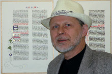
After several test pages, we were able to pull a page that was clean and hold it in position with clips until I could get a good picture for the cover. We experimented with different lighting conditions, paper stocks, and lens openings until I got one that I felt was usable.

And from that we get the final artwork for the cover. I tried various alignments and actually have pictures in which the type lines up almost perfectly horizontal on the page, but I like the dynamics of this shot the best. (It wraps around the spine and back cover as well!)
I’ve always been a big fan of photographic covers on most adult fiction, but also have had a hard rule that the photo would not include the type. Now I’m breaking that rule, but to make sure that the type is clean and clear on the cover, I did a little black enhancement in Photoshop being careful not to affect the letterpress edge of the characters.
The Gutenberg Rubric will be released in July.
Subscribe to:
Post Comments (Atom)
0 comments:
Post a Comment